Foreword
Data are all around us and always have been. Everything throughout history has always had the potential to be quantified: theoretically, one could count every human who has ever lived, every heartbeat that has ever beaten, every step that was ever taken, every star that has ever shone, every word that has ever been uttered or written. Each of these collective things can be represented by a number. But only recently have we had the technology to efficiently surface these hidden numbers, leading to greater insight into our human condition.
But what does this mean, exactly? What are the cultural effects of having easy access to data? It means, for one thing, that we all need to be more data literate. It also means we have to be more design literate. As the old adage goes, statistics lie. Well, data visualizations lie, too. How can we learn how to first, effectively read data visualizations; and second, author them in such a way that is ethical and clearly communicates the data’s inherent story?
At the intersection of art and algorithm, data visualization schematically abstracts information to bring about a deeper understanding of the data, wrapping it in an element of awe.
My favorite description of data visualization comes from the prolific blogger, Maria Popova, who said that data visualization is “at the intersection of art and algorithm.” To learn about the history of data visualization is to become an armchair cartographer, explorer, and statistician.
Early visual explorations of data focused mostly on small snippets of data gleaned to expand humanity’s understanding of the geographical world, mainly through maps. Starting with the first recognized world maps of the 13th century, scientists, mathematicians, philosophers, and sailors used math to visualize the invisible. Stars and suns were plotted, coastlines and shipping routes charted. Data visualization, in its native essence, drew the lines, points, and coordinates that gave form to the physical world and our place in it. It answered questions like “Where am I?”, “How do I get there?”, and “How far is it?”
Early data visualizations were also used to answer questions pertaining to issues of public health. Epidemiologist John Snow’s 1854 London cholera map was created to record instances of cholera in a London neighborhood, pinpointing the cause of the outbreak to a single well. This knowledge gained from patterns in lists of names, numbers, and locations was then used to persuade London’s populace to install sewer systems to alleviate the proliferation and spread of disease. The human brain is particularly adept at recognizing patterns, and a good data visualization, like Snow’s, optimizes displays of these patterns through effective use of Gestalt theory, design principles, and color. (Or lack of it, as this case may be.)
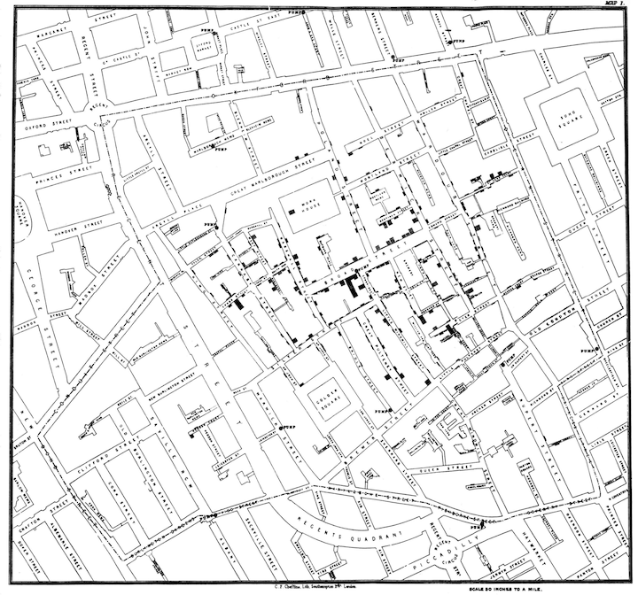
John Snow's cholera map (published by C.F. Cheffins)
Edward Tufte’s visualization of Snow’s cholera map, with its absence of color, optimizes Gestalt’s theories of visual perception, most notably “Proximity” and “Figure and Ground.” The small black dots, each one representing a single case of cholera are small black figures standing out in contrast against the ground: in this graphic, the lines and white space representing streets. The proximity of these dots around the affected well are what enabled Snow to determine the exact source of the outbreak. Today, even with our advanced computing systems and sophisticated tools for creating data visualizations, there is little you could do to improve the effectiveness of this chart. It is simple, beautiful, and true: a data visualization that saved lives.
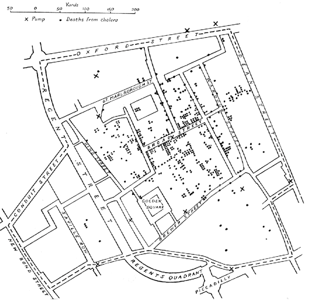
Edward Tufte's visualization of John Snow's cholera map
Florence Nightingale, famous more for her nursing skills than her analytic prowess, was nonetheless also a master data scientist and storyteller. Through data presented via her signature Coxcomb diagram (also known as polar or rose charts), she convinced the British army to invest in sanitation measures after illustrating that the majority of deaths in the Crimean War were the result of preventable diseases caused by the horrible sanitary conditions in hospitals. “Why are we sick?” she asked, then answering the question herself by giving visual form to data.

Looking at this graph, it is readily apparent that preventable diseases outnumbered all other causes of death. The area in blue represents deaths by preventable diseases, measured from the center, with red representing deaths caused by injuries and black indicating all other causes. Design principles at play here include the addition of color theory to take advantage of more Gestalt principles: “Similarity” and “Continuity”. Color makes it easy for us to tell which segments belong to which category. It also helps to draw the eye in a continuous path around the graphic, making it easier to read.
There is debate over the quality of this chart. Some claim it one of the best, most memorable visualizations ever created, not solely because of its visual communication strength, but in spite of it. It is remembered because of the change it inspired. Others deride it, claiming it’s just a glorified pie chart, suffering from the same misrepresentation of the information by distorting the data: in terms of visual perception, humans have a hard time accurately judging measures represented by differences in area. Despite their ubiquity, pie charts, for this very reason, are an incredibly poor way to visualize data. A simple stacked bar chart with reference lines, while not as beautiful or visually intriguing, would have communicated more effectively and on a quicker read.
We still ask the same kinds of questions that Snow and Nightingale posed, and as curious humans, probably always will. But the major differences today are that we have the means with which to gather much larger, richer datasets. And we also have the tools with which to automate visualizing our data.
This isn’t to say that small datasets, like the ones Nightingale and Snow observed, are any less valuable or interesting. Thanks to data gathering technology and advances in wearable computing and the Internet of Things, to the contrary. My friend Jen Lowe, a data scientist and artist working in New York, recently published her heartbeat on the internet. As a flat, static visualization, it would be beautiful but not especially informative. But by adding interactivity and live data feeds of her pulse via wearable sensors and API calls, her heartbeat is a living, beating, digital thing, viewable by anyone, anywhere, at any time. What you have is insight into another human being like you’ve never seen before.
Unique insight is the essence of data, both big and small, and the result of the tools that allow us to access, probe, poke, prod, dissect, visualize, and hopefully, make sense of it. Tools which, through the democratization of data visualization, allow us to change our lens on the world, creating pictures of humanity from different perspectives, bringing into focus stories about humanity and the world that were previously invisible, allowing us insight into ourselves like we’ve never seen before.
Callie Neylan
Senior Designer, Microsoft